A new kind of shopping list that educates and lessens food waste.
Shopping lists turned food tracker with an aspect of community sharing helps shoppers fight food waste with minimal effort.
Deliverables: User Research, Persona, User Flows, Sketches, Prototypes
Role: Student project for Springboard UX/UI Bootcamp
Timeline: 20 weeks
THE CHALLENGE
People are too busy to care about food waste
By now most people know that food waste has a detrimental effect on the environment. But the issue is people don’t care enough to alter their lifestyles to help improve circumstances. The goal is to create a solution that benefits users, but also educates and reduces household food waste with minimal effort on the shoppers’ end.
SOLUTION
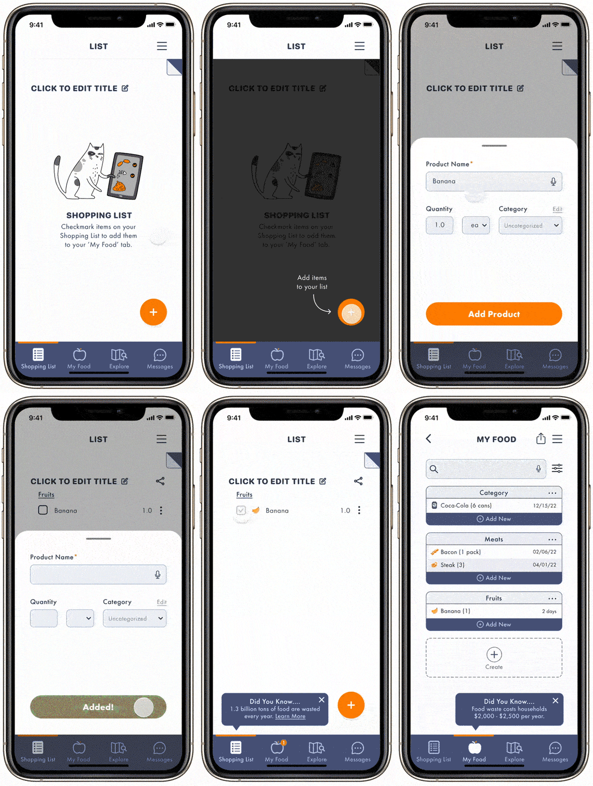
Convenience minimizes household food waste
Preplanning decreases food waste + Facts
Helps avoid purchasing more food than needed
Instantly adds food from shopping list to food storage system
Clean and simple interactions to help focus on the task at hand
Facts at the end of each flow to educate users
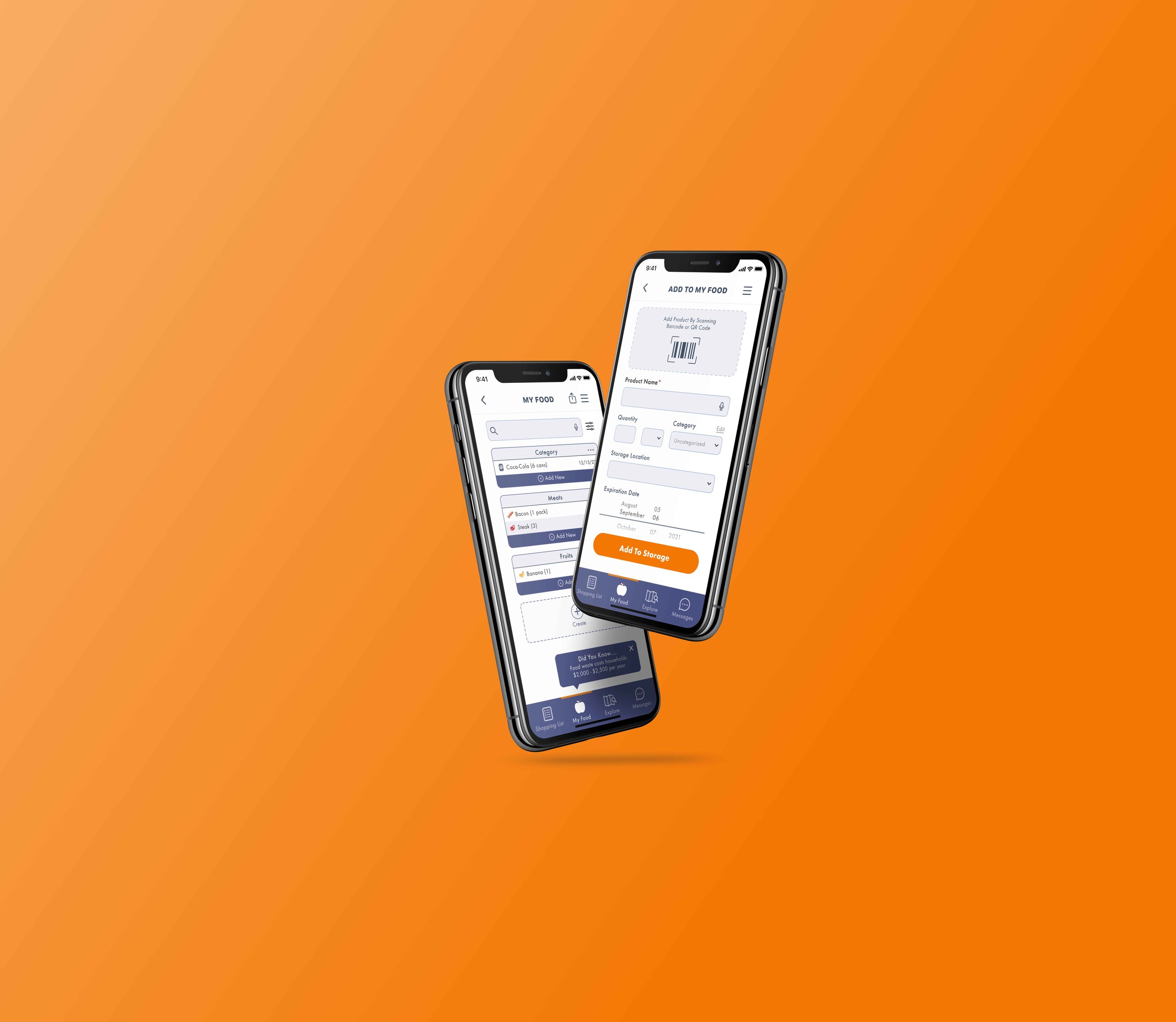
2. Manage your food + Facts
Manage and organize via expiration
date so you know exactly when your food goes badBarcode feature to streamline food tracking process
Easy to customize and categorize by location or food type
Facts at the end of each flow to educate users
3. Community aspect promoted engagement
Explore donation/compost sites and excess food nearby
Find or post excess food to share within the community
Facts at the end of each flow to educate users
RESEARCH
Household food waste leads to feelings of guilt
Prior to sending out screener surveys and conducting user interviews, I made a couple of assumptions:
People like discounts because who doesn’t like to save money.
If supermarkets had a platform to sell their excess foods at a discount, then what normally goes to landfills can become a profit for the company. A win-win for both parties.
During my user interviews, it became clear that my target audience was unwilling to spend time to find discounts even though they verbally said they wanted to save money. At most, they would just compare prices between the items on display. In exploring the psychology of discounts, discounted items can actually lead people to see the item as of lesser value or quality.
Affinity diagram from user interviews
What I found during my affinity mapping was that all users felt guilty when the food in their homes spoiled due to forgetfulness. That’s when I realized I had to shift my focus from supermarket to household food waste. I used the findings from the affinity map to draft up a persona that embodied the values, thoughts and struggles of my target audience.
Persona
Meet Lisa. Lisa doesn’t plan what she’s going to buy when she goes grocery shopping and often loses track of what she has in the fridge. Both of these things cause her to waste money and harm the environment.
Lisa’s Pain Points:
Feels guilty wasting food
No time to look for discounts/save
Not sure how to waste less
The next step is to ideate on solutions that would tackle Lisa’s pain points.
IDEATION
Shopping lists to transfer items to a food tracking system
After discovering the aforementioned pain points, I executed two Crazy Eights sessions to further explore some possible options and features that reflected my user’s needs.
Crazy Eights Ideation
The possible solutions that seemed most viable were:
Shopping Lists that transfer items to a Food Tracking System when checked off + Facts
Food Tracking System to remind users of best by dates w/ barcode capabilities + Facts
Explore Feature to share or find excess food + donation and compost centers + Facts
Education is the driver for change
Since I didn’t want to create a platform that focused solely on education as that would severely limit my audience, I decided to have facts be present at the end of each flow, but only as the secondary focus.
Food tracking decreases feelings of guilt
By providing a seamless way of using shopping lists to track food, users will receive notifications when foods are nearing their expiration dates. That way food will no longer be forgotten in the back of fridges.
Community bridges people together
The idea behind providing a community space is to allow users to have a place to discover or post excess food easily. The Community and Explore feature enables users to deal with their excess food in a healthier manner via compost, donation or sharing with other users which alleviates guilty feels associated to tossing food away.
ITERATION
Improving usability through testing
Conducting four rounds of usability testing allowed me to really pinpoint the friction points during each stage of designing.
The following are the improvements made:
Explore vs community tab unclear
Users were confused from the difference between the ‘Explore’ and ‘Community’ tabs.
Faster response time by 30% when the tab was labeled ‘Messages’ instead of ‘Community.’
2. Barcode button not immediate
When given the task to add a product in a way that would be faster than typing, the majority of users still tried to type.
By enlarging the barcode and making it the first thing users see, the reaction time to finding the barcode button decreased by 50%.
3. Chat confirmation is confusing
People were confused with a need for a calendar confirmation.
Initially this was supposed to help with user rating to ensure user reliability when exchanging food, but was removed completely as it lead to unnecessary confusion.
Final prototype
Takeaways
Having just completed my first UX project, I was able to see how user feedback and iteration improved a product. This project taught me so much, including:
Perfection doesn’t exist. I encountered multiple situations where I wanted to fix everyone’s pain points, incorporate all the insights and create the perfect app. My empathy meter was through the roof! I had to take a step back and reshift my focus towards the main problem that I was solving by going back to my problem statement.
Iterate, but times 3. Each time I conducted user testing, I found ways to improve the app. Whether it be larger buttons to improve visibility or less copy as to not overwhelm the user, these were all things I wouldn’t have thought twice about had I not tested my designs.
Design with intent. This project really allowed for me to exercise my communication skills and learn how to explain my design decisions. By doing so, I was able to see if everything was designed with intent via research and insights and if they weren’t, then finding ways to transform the designs so that they did.
Reflection
Although there are many things I would have liked to do differently, I think this solution is a good place to start tackling household food waste. Going forward, the next steps I would like to explore are:
Points/Reward System when using the app to reduce food waste while also compiling data to show users their carbon footprint.
Expanding the Community aspect to include a forum section complete with recipe recommendations for the foods users have in their storage that need to be used up.
In summary, people need to realize the consequences of their food waste habits. Everyone has the responsibility to do their part in cleaning up the mess we leave behind. What better way to start than in our own homes?


